A+ content allows brands to showcase what makes their product line truly special. And for brands selling in highly competitive Amazon categories such as Beauty & Personal Care, quality A+ content can be the difference between success and failure.
This begs the question – what makes good A+ content? Unlike other parts of the Amazon ecosystem which have more of a standardized format, A+ content is more of a ‘choose your own adventure’ tool which gives brands the freedom to replicate marketing material they have created for their ecommerce website on their Amazon listings.
Business Insider ranked Bobsled as one of the top Amazon firms, and we have deep experience optimizing product listings for Beauty & Personal Care brands. Below we have shared some guiding principles from some of our optimization projects that will improve your A+ content and improve your traffic conversion metrics. Read on to learn more!

User Experience
A+ content caters to the more discerning online shopper, someone who wants to learn as much about your brand and product line before making a purchase decision. Therefore, to make the biggest impact with their A+ content, beauty brands need to get very familiar with the Amazon shopper user experience.
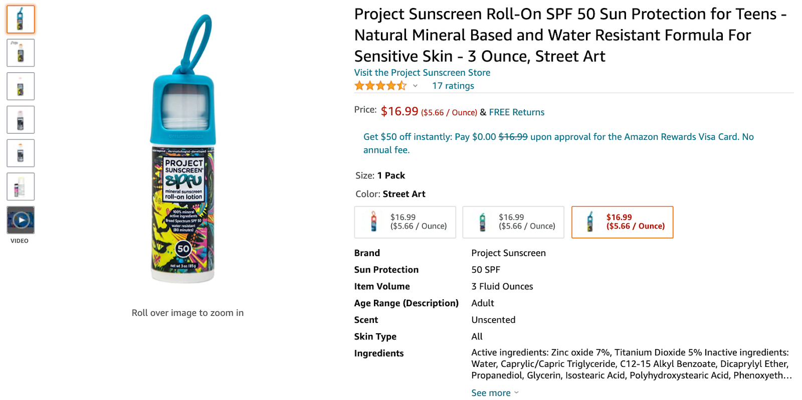
Before they reach your A+ content, the vast majority of shoppers will view the title, variation options, and product images presented in the standardized Amazon format at the top of the page.

Above: Screenshot from the Project Sunscreen Amazon listing
Then, after scrolling past a block of Sponsored Product ads, shoppers will reach your A+ content. Bear in mind that many potential shoppers will be eager to read the product reviews which appear at the bottom of the page, so you will need to try and grab their attention with your A+ content. A good way to do this is with a bold, brightly colored banner at the top of your A+ block.
Above: Screenshot from the Murad Amazon listing
Ultimately there is no ‘right’ or ‘wrong’ way to construct a block of A+ content. The flow of content should depend on the specifics of your brand and product line. One beauty brand may choose to lead with their mission statement, while another may choose to wedge it right in the middle of their A+ block.
The guiding UX principle for all should be that your A+ content should be telling a mini-story within your Amazon product listing. And the ending of that story should involve the customer adding your item to their cart!
Above: Screenshot from the REN Amazon listing
Lifestyle Imagery
Beauty brands should use lifestyle imagery to target specific customer segments. Nothing can bring a product listing to life quite like a happy human face, and when executed intelligently, there is an aspirational quality to lifestyle imagery that is very powerful. You are essentially letting each browsing shopper know “these are the type of people who will love our products the most, and this is how our product will improve their lives.”
So be bold! Liven up your A+ content just like you would a double-page ad in a glossy magazine.
Above: Screenshot from the Project Sunscreen Amazon listing
Cross-Sell and Up-Sell
Brands in the Beauty & Personal Care space often have products that naturally complement one another e.g. daytime moisturizer and overnight cream. Therefore, it makes sense to use your A+ content to educate shoppers about similar products in the interest of cross-selling and up-selling.
By creating an infographic grid, you can quickly break down the core differences between each product. And you can embed a hyperlink into each image within the grid so shoppers can open more Amazon listings if something catches their eye.
Above: Screenshot from the REN Amazon listing
💡 Check out Best Amazon Brand Stores: Tips, Mistakes, and Examples
White Space
Rather than creating an A+ content block that’s absolutely jam-packed with text and imagery, it may make more sense to leave sections with plenty of white space. This will draw more attention to the content that does appear on the page, and it will help the whole section breathe.
Above: Screenshot from the Murad Amazon listing
Statistics
Beauty brands often complete a ton of research during product development and the FDA approval process. A common mistake is to simply dump all of this information into a block of A+ content.
Even though all of this information could be pertinent to browsing shoppers, a block of text filled with facts and figures is probably not going to be easy on the eye. A far more effective strategy could be to cherry-pick a compelling statistic and present this in a visually enticing way. This makes it super easy for customers to remember and may be the deciding factor in their decision-making process.
Above: Screenshot from the REN Amazon listing
Mission Statement
Beauty & Personal Care is an incredibly crowded category on Amazon. Each one of your products is likely competing with hundreds if not thousands of similarly priced items.
So how do you get an edge? One way is to develop a meaningful emotional connection with Amazon shoppers. By including a mission statement within your A+ content, beauty brands give themselves the opportunity to succinctly state what sets them apart from the rest. A shopper will choose a brand they have an emotional connection with over an anonymous competitor every day of the week.
Above: Screenshot from the REN Amazon listing
Takeaways for Beauty & Personal Care brands
- Treat your A+ content like your own ecommerce website – make it as unique as possible
- The best way to make an emotional connection with shoppers is through great storytelling
- Understand how A+ content fits within the broader context of the Amazon marketplace

Tagged: PPC Advertising, Amazon Account Management, Amazon Display Advertising
.png)

